YMCA
A fundraising framework to bring YMCA’s communications to life

Belong, contribute and thrive
YMCA is the oldest and largest youth charity in the world, supporting a quarter of a million young people in England and Wales every year. The organisation's mission aims to help all young people to play a fulfilling role within their communities, so they are granted the opportunity to belong, contribute and thrive.


What we delivered
– Brand development
– Stakeholder engagement and C-suite presentations
– Messaging
– Brand guidelines
– Interactive PDFs, templates
Fundraising brand extension
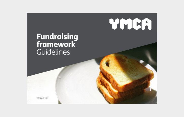
The fundraising framework created by Red Stone takes its cue from a combination of the existing brand guidelines and new research, in order to create a broad range of fundraising collateral that would sit harmoniously alongside the core brand. The goal of the new framework is to deliver a solution that is recogisably YMCA – to promote its mission, yet to be clearly defined as a fundraising activity.
After an initial consultation period with YMCA staff, opportunities were identified for how the brand could be utilised more effectively for fundraising purposes. As a result, Red Stone helped YMCA to better define their brand strategy and audience personas, which enabled the charity to create a clearer picture of their customer journeys. Through more cohesive messaging, YMCA was then able to maximise the effectiveness of their communication output to suit each target audience.
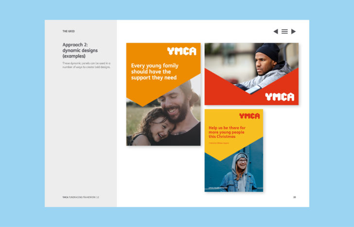

In addition, Red Stone provided additional guidance on how the brand’s existing triangle grid could be used in a more distinctive and simple way, as well as use of the colour palette, messaging and photography. For example, images must always tell a story of real young people, to convey the core brand idea: ‘We are for all young people’.

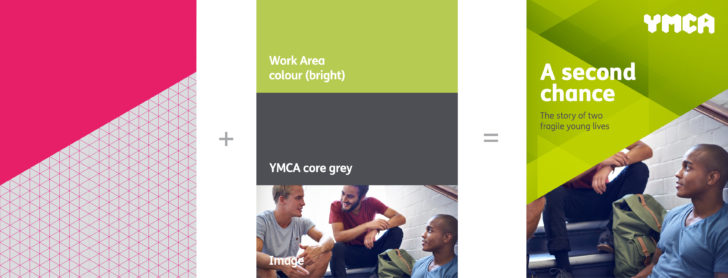
The existing brand’s grid is made up of the YMCA triangle and is a useful tool for creating graphic shapes. We used it form a series of dynamic layouts, where simpler shapes act as containers for messaging and photography.
We recommended using the core YMCA grey alongside just one of the more vibrant colours, to ensure the materials feel both ‘official’ to represent the charity as a major organisation, while also appearing lively and youthful.
