Papilo
Brand transformation
Papilo is a waste and recycling company with a focus on sustainability and the circular economy. Driven by a belief that there's a better way for businesses to approach waste, they use data and bespoke technology to help their customers use less, reduce their environmental impact and turn waste into something new.
Red Stone was commissioned to transform the brand and name to reposition them as a distinctly different choice within the sector and lay the groundwork for planned expansions into new markets.
What's in a name?
The company, formerly Roydon recycling, has been providing an alternative approach to the industry norm for some time, but their brand hadn't kept pace with their innovative approach.
We conducted an extensive naming process, helping define the new approach and set the tone for the brand. Keen to position themselves as disruptors in the sector, with a focus on sustainability and insights, the name needed to shift expectations.
Something transformational
A modified version of the word 'papilio' (Latin for butterfly), the concept of transformation became the starting point for the brand.
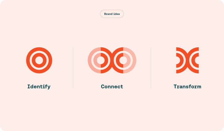
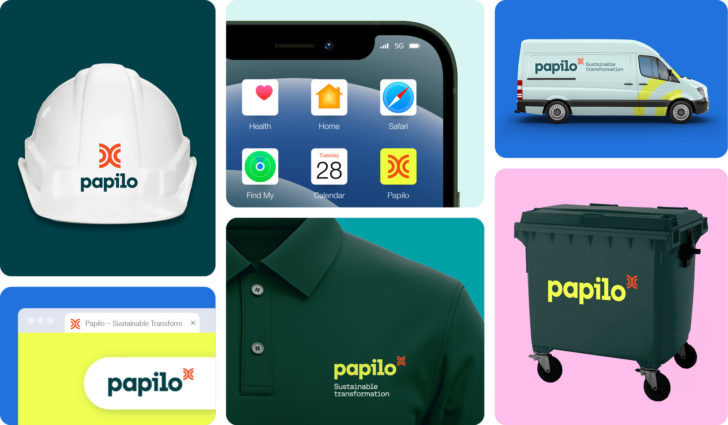
Bringing the brand idea together, we created a clean, simple logo that distilled Papilo's approach that speaks about data and connection that also reflects their new strapline – Sustainable transformation.
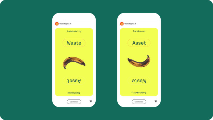
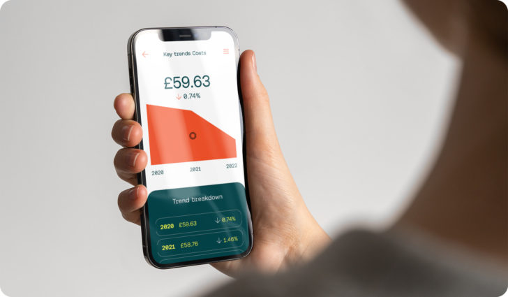
Bold simplicity and the beauty of data
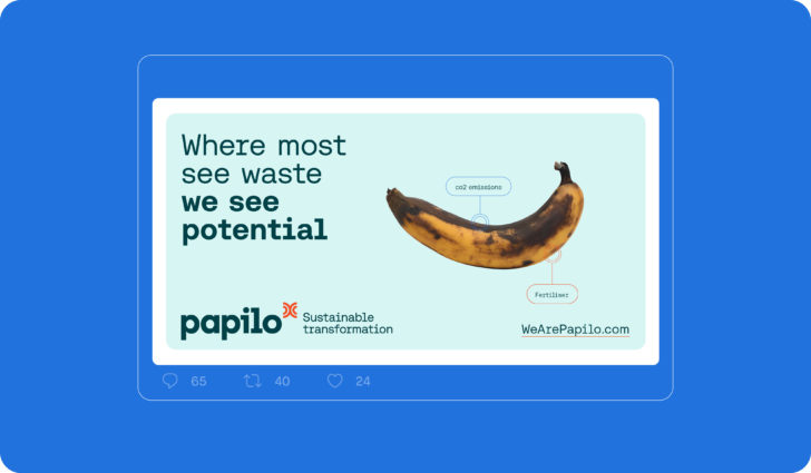
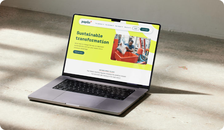
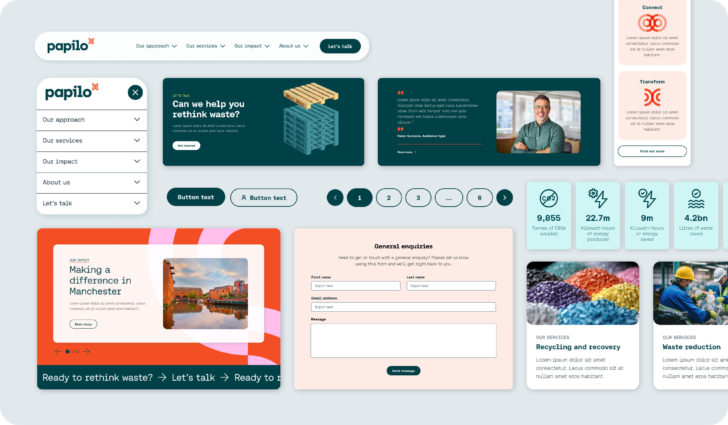
We brought life to data, stripping back complexity to communicate with a bold and accessible simplicity. This visual approach extended to photography, heroing everyday objects as they are. Showing it like it is, browning bananas and all.
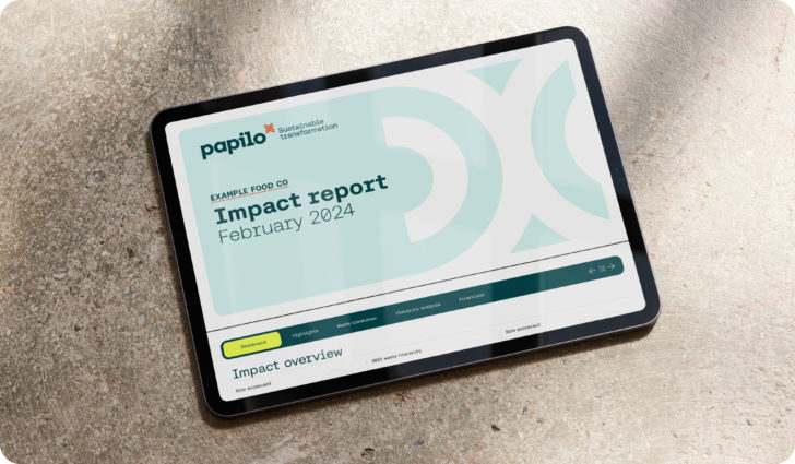
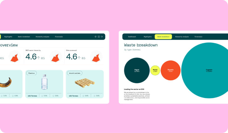
Pixel precision to real world impact
The result is a bold brand that sets Papilo apart in the sector. Equally at home on an app as a hard hat, the brand reflects the commitment to rethink waste, find opportunity through data and drive more environmentally friendly practices.
Transform Awards 2025
Gold: Best visual identity by sector: Industrial and basic materials
iF Design Awards 2025
Finalist: Communication: Company Branding
Design Masterprize Awards (DMP) 2024
Winner: Brand Identity
Best Brand Awards 2024
Award of Excellence: Logo design

