National Youth Agency
Brand refresh for a youth charity
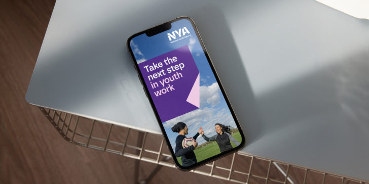
Bringing new life
The National Youth Agency (NYA) is the Professional Statutory Regulatory Body for youth work in England, offering guidance, support, advice, training, and staff development opportunities for youth workers and youth work organisations.
Red Stone was invited to bring new life to NYA's brand, working with the existing logo and exploring new ways to bring a more contemporary feel to the visual identity across all of the charity's communications.
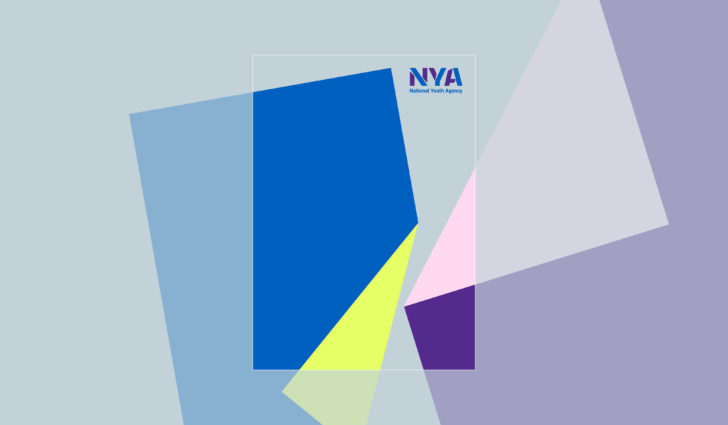
A solid, ownable approach
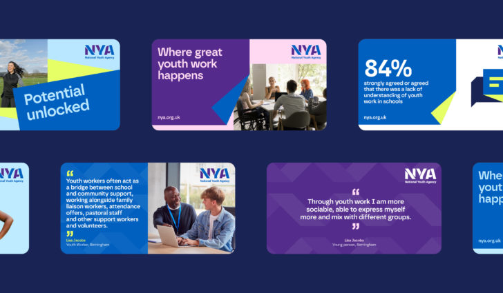
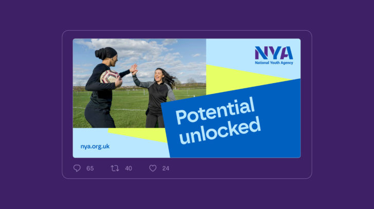
The opportunity for a more exciting and cohesive visual language was present in the existing NYA logo. Building on the idea of folds and transformations gave NYA a solid and ownable graphic approach to build upon.
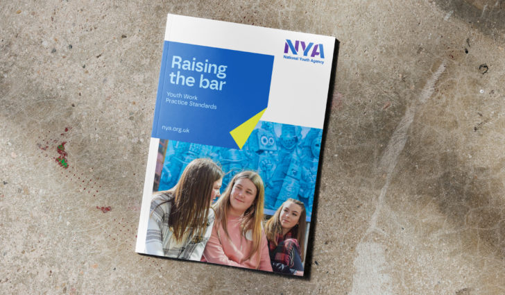

Dialling up brand personality
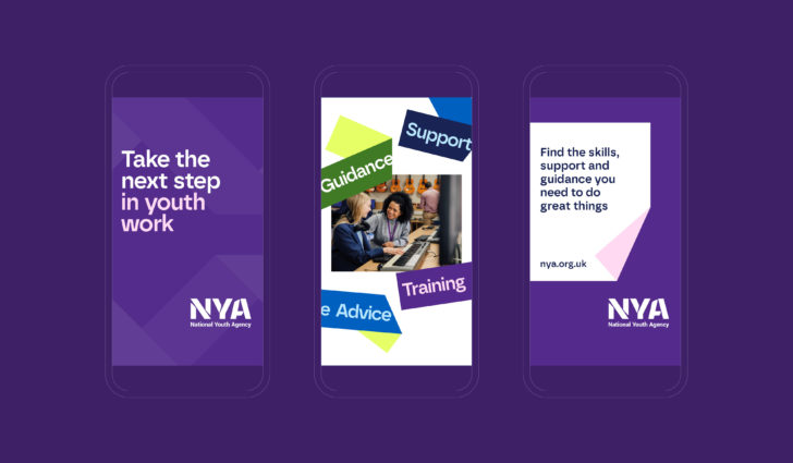
To help improve brand recognition and to dial up brand personality, we developed a more distinctive approach to type and typography. To acheive this, we recommended a new typeface and approach to information hierarchy.


Vibrant and accessible colour
We reviewed and expanded the secondary colour palette to include lighter and more vibrant colours, allowing greater scope for communications. This, with the introduction of accessibility guidance, ensures that when colour is used for type it meets WCAG AA accessibility as a minimum.
Uniquely NYA
Informed by the logo and the expanded use of the fold device, we created icons for specific key areas and themes. The result is an icon set that is uniquely NYA.

Proactive, positive, empathethic
Images capture youth workers with young people in proactive and positive situations, as well as more serious and empathetic moments of conversation.

Taking youth work to the next level
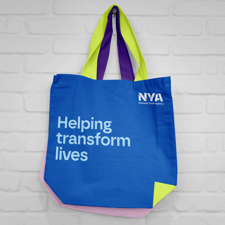
The result is a dynamic, flexible brand that can generate impact with ease, giving youth work the platform it deserves.
