The Portal Trust
Championing opportunities for young London

Refocusing a charitable trust’s brand
The Portal Trust enables young people in London, particularly those from disadvantaged or low income backgrounds, to experience life-enhancing educational opportunities.
The Trust, formerly Sir John Cass’s Foundation, commissioned Red Stone to undertake a rename and rebrand to enable them to communicate more effectively with their audiences and re-connect with their core purpose.
What we delivered
– Brand strategy
– Brand creation
– Stakeholder engagement and brand workshops
– Naming, verbal identity and messaging
– Visual identity
– Illustration, infographics, icon set
– Brand guidelines
– Brand film
– Website scoping, design and build
– Social assets
Finding an authentic brand position
In response to a greater awareness over the historical associations of its founder, the Foundation had a strong desire to create a new focus for its work and activities. We began with a wide-ranging stakeholder consultation, to understand the thoughts and feelings surrounding this change and help us start to position the brand in a more outward-looking direction.
Connecting with the Trust’s purpose
We held interviews to explore their current positioning, what the future might look like and the risks associated with a re brand.
It became clear that a new name and brand would be an exciting opportunity to move beyond the organisation’s history and connect far more with its charitable purpose, with a real focus on beneficiaries and partners.
The new brand
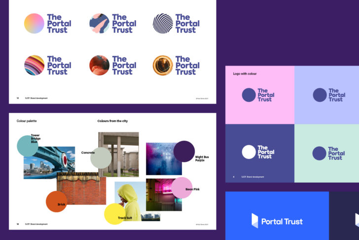
We completed a name generation phase to find a name that resonated with the audience and stakeholders. The new name ‘Portal Trust‘ evolved from the Trust’s vision to ‘support all’.
A compelling brand story clarifies their vision, values and personality which informs the new visual and verbal expression.
A bold and brave renewal
A phrase from the interview process stood out: “Be bold... as brave as possible”.
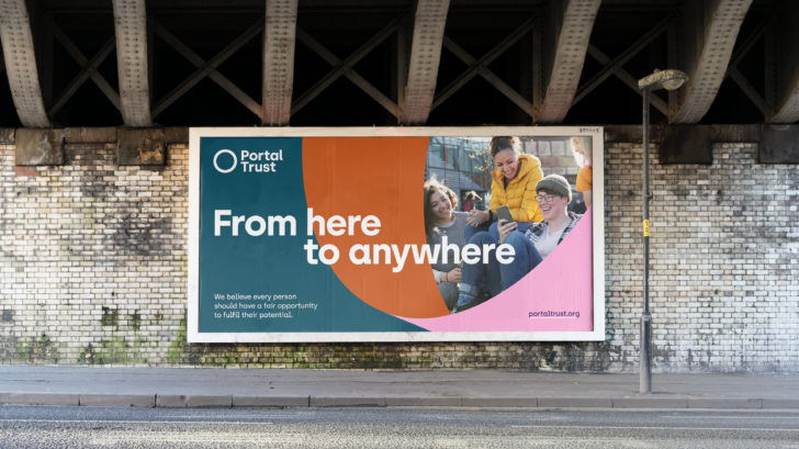
It was vital that the visual expression of the brand responded to our new focus, as a bridge between today and tomorrow, enabling opportunities and connecting young people in London with their full potential.
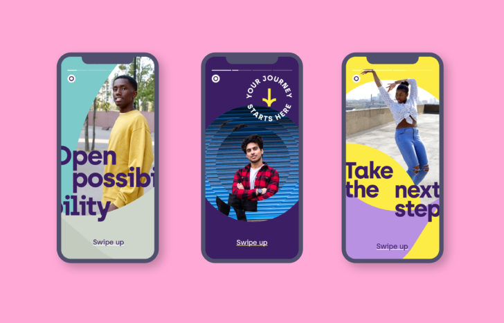
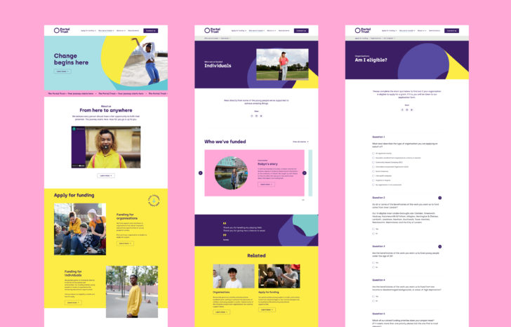
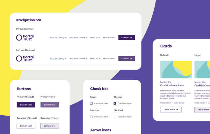
"We’re excited to announce our brand has evolved with a fresh new feel and strapline, that we believe reflects our vision, core proposition and most importantly our valued community."
Chief Executive, The Portal Trust
