HFEA
Brand refresh for an independent regulator

A new brand for a pioneering organisation
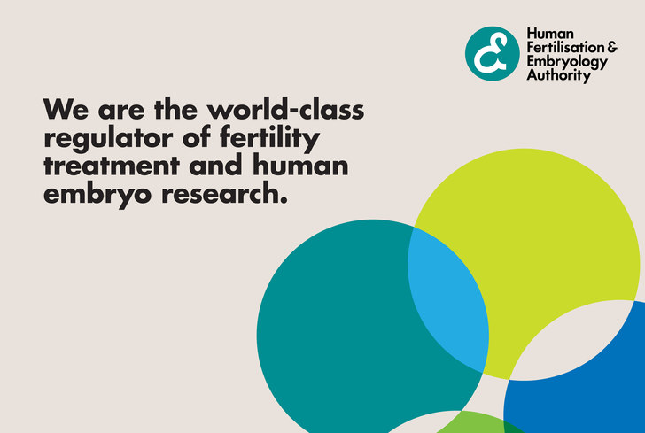
The Human Fertilisation and Embryology Authority (HFEA) is a world-class regulator of fertility treatment and human embryo research, and the first statutory body of its type in the world.
What we delivered
– Brand strategy
– Brand development
– Reporting
– Stakeholder engagement
– Verbal identity and messaging
– Illustration, infographics, icon set
– Social assets
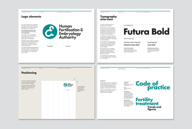
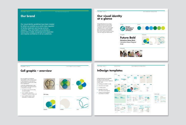
– Brand guidelines
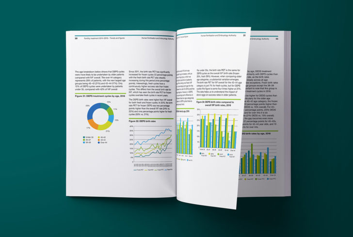
– Interactive PDFs, templates
– Print

Our approach
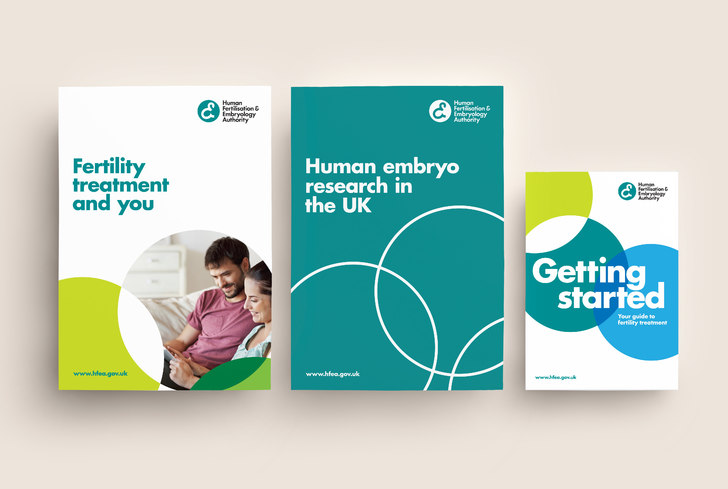
Collaborating closely with HFEA, we developed a new visual solution that centres around an updated version of the existing logo.
We modernised and simplified, with the primary logo placing the four words that make up the name stacked, so the acronym reads clearly, within a vertical line. As part of the refresh, HFEA has brand assets for the first time ever, and detailed guidance to support the new identity.
Appropriate, harmonious and consistent
The new HFEA identity represents a step-change in the expression of the brand. Its main objectives are to reflect and promote the brand's vision, purpose, principles and tone; to create a brand that's both recognisable and consistent, while remaining flexible and adaptable – always meeting the needs of the HFEA audience.
By rationalising and creating supporting brand assets, we were able to ensure all communications are appropriate and harmoniously HFEA.
