Energy Saving Trust
Delivering a zero carbon society
Meeting the needs of the cost of living crisis
Energy Saving Trust is an independent organisation dedicated to promoting energy efficiency, low carbon transport and sustainable energy use. They enable everyone – governments, businesses and everyday households – to play their part in building a sustainable future.
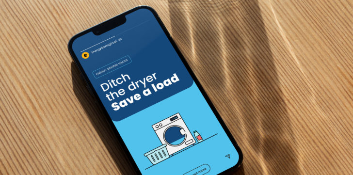
But addressing the climate emergency during a cost of living crisis needed a new plan of action. The organisation found its services increasingly sought by consumers seeking trusted information about reducing their energy needs. Red Stone were commissioned to deliver a brand refresh that would build on the existing brand, but enable it to be more approachable and inclusive in its approach.
Everyday expert
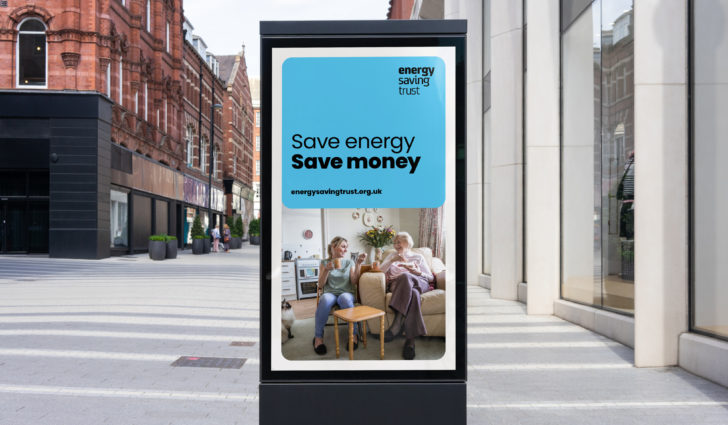
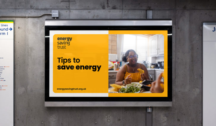
We brought the brand personality of 'everyday expert' to the fore and boosted it to underpin all brand outputs. Being seen to be both approachable and trusted is integral to reaching Energy Saving Trust audiences, to help them take the steps they need to make a positive change.
Adding range
To effectively reach their diverse audiences and engage with a wide range of subjects, equipping Energy Saving Trust with an adaptable tonal range was essential. Although the organisation has a consistent and strong message, having the ability to dial up and down aspects of the brand gives them a flexible consistency to meet the needs of different audiences and situations.
Fine tuning the basics
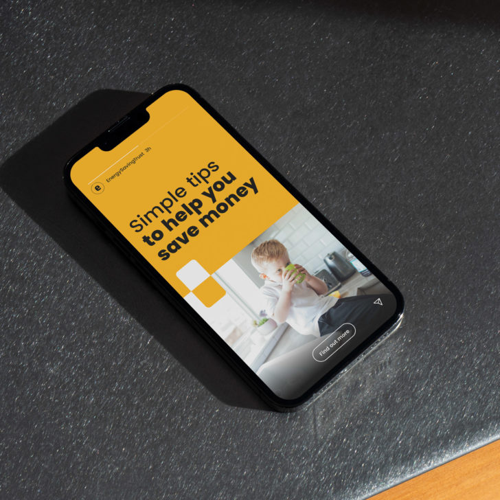
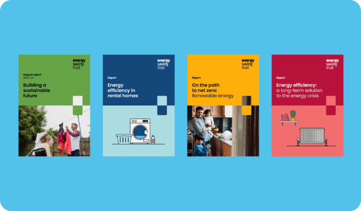
We expanded the existing colour palette to create harmonious tonal sets with rich, bright and light colours, with clear guidance on how to use them. Adding additional weights of the brand typeface helps give flexibility and impact.
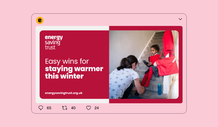
Illustrating the issue
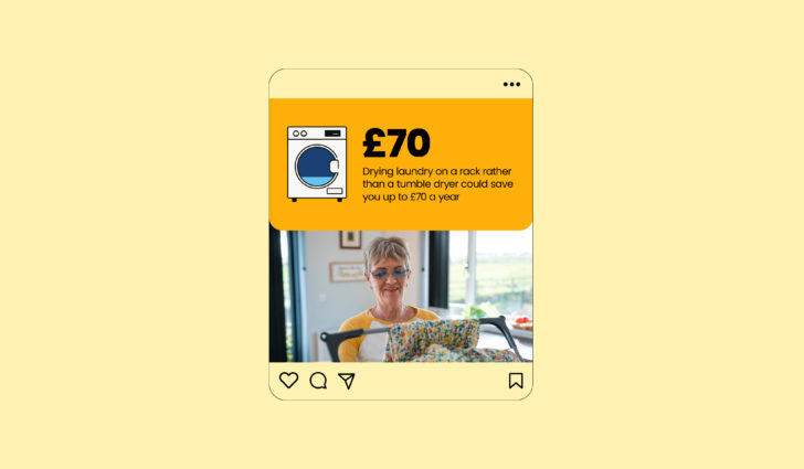
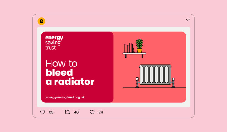
We created a new and distinctive suite of icons and pictograms to help signpost, add context and bring a human side to communications as an alternative to photography.
Making the switch
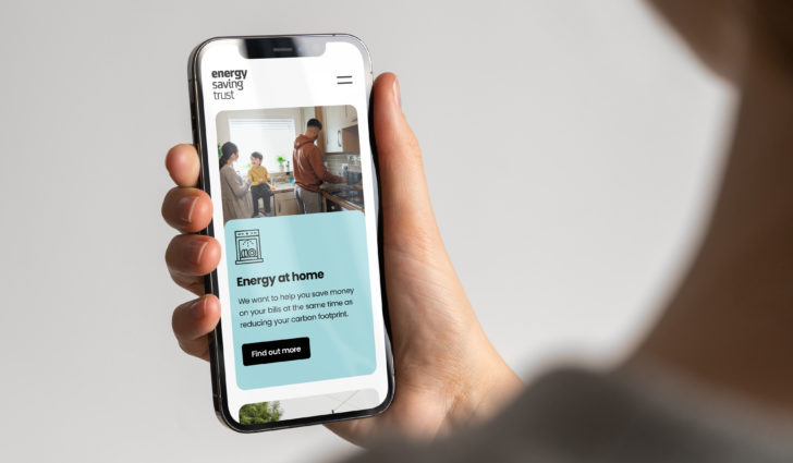
The brand's visual concept is based on the switch - the everyday and universal symbol for saving energy. We developed and refined the existing switch device to make it more unique and hard-working.
Refining its shape and structure to more closely relate to the character of the logo.
The new switch also offers a more dynamic approach, adapting to format and content to create a richer visual language to draw from and improve usability.
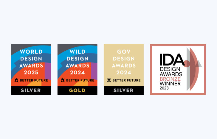
Better Future WORLD Design Awards 2025
Silver: Graphic Design - Identity and Branding
Better Future WILD Design Awards 2024
Gold: Graphic Design - Identity and Branding
Better Future Gov Design Awards 2024
Silver: Graphic Design - Identity and Branding
IDA International Design Awards 2023 (USA)
Bronze: Multimedia-Brand Identity
"It’s been a pleasure to work with Red Stone to develop our brand. The team has expertly guided us to find creative and engaging solutions to extend our brand and reinvigorate our channels, and have also helped keep all projects on track and running smoothly – the perfect mix of creativity and organisation!"

