AAT
Supercharging an industry leader

Real world ready
The finance and accountancy industry can be a closed shop, with the focus often on theoretical knowledge and access only open to those who get qualifications through higher education.
AAT offer a solution. As the world-leading body for accounting technicians, they provide practical, skills-based qualifications that are open to everyone, regardless of background or experience.
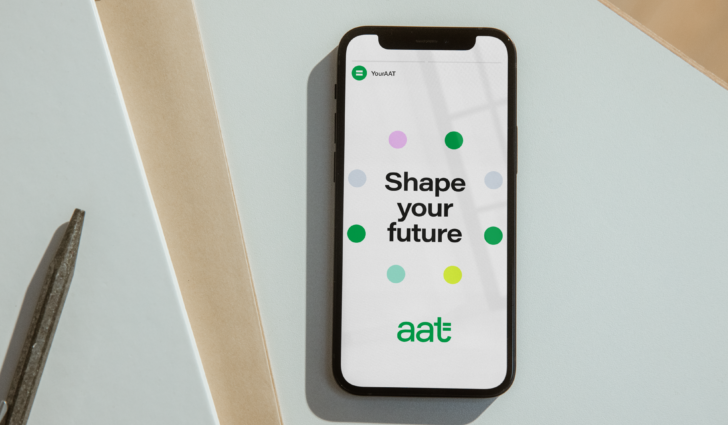
We partnered with AAT to evolve their brand strategy, redefine their brand position and create a refreshed visual and verbal identity that gives them the flex to connect with their wide range of audiences.
Digging deep
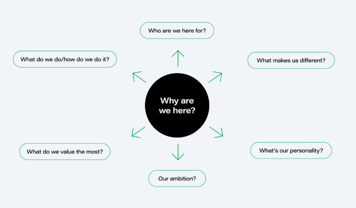
We undertook a deep dive into all things AAT, carrying out a comprehensive audit process alongside a series workshops and interviews. Engaging key stakeholders from across the organisation, we built an understanding of AAT's position in the market and their unique purpose to help us identify territories for the new brand proposition.
Practically different
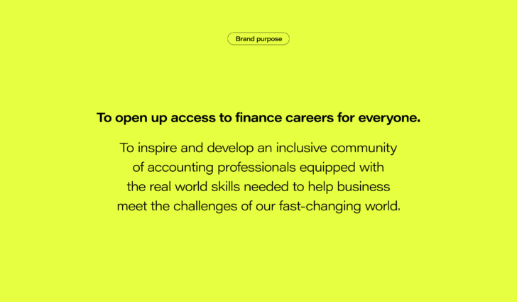
At the heart of AAT is the belief in open access and practical skills to ensure the profession remains relevant in our ever-changing world. Our brand proposition ‘Real world ready’ distilled these truths to position AAT as a practical, agile and inclusive alternative to the wider industry.
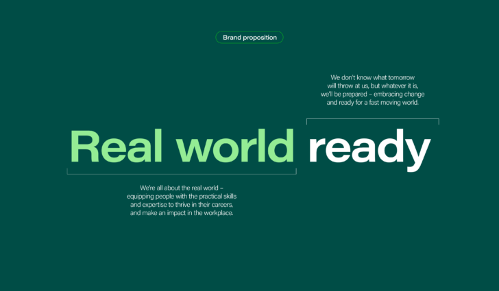
The 'Real world ready' concept became the central pillar of the new brand strategy and the foundation for the visual and verbal identity.
Flex-ability
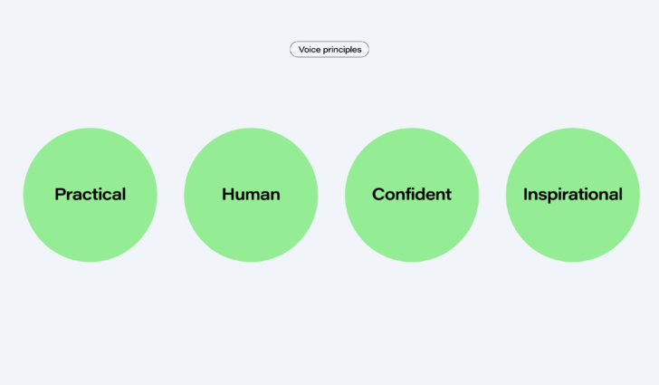
From students to employers and policy makers to a global membership, AAT's audiences are diverse. Giving the brand the tonal flex to speak to all these groups, whilst always sounding unmistakably AAT, was a key part of the brand evolution. We developed a robust tone of voice, built around a simple tonal scale that allows communications to respond to the needs of any audience or situation.

Embracing the equals
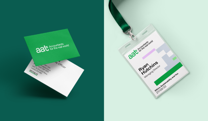
The existing AAT logo had a strong concept, built around a unique ‘t’, but it's execution wasn’t optimised for a digital environment and it wasn't visually aligned with the new strategy. We evolved the marque from top to bottom, creating a logo with the personality and refinement needed to reflect the ambition of AAT.
Quiet to supercharged
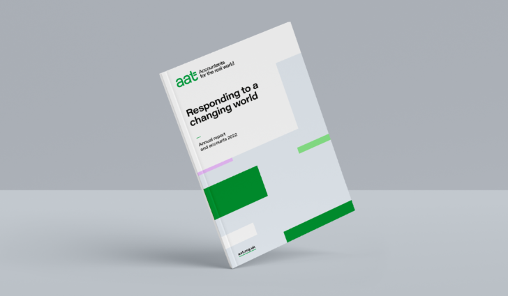
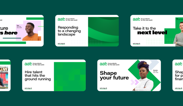
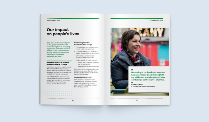
The principles of the tonal range established in the verbal identity, extend into typography and graphic assets, to create a consistent, dynamic brand system that runs through everything that AAT do.

Giving brand equity some energy
The brand had built a huge amount of equity in both the brand green and the equals symbol. Working alongside AAT's in house brand team, we breathed new life into these existing assets.
The core green was expanded into a full tonal set of greens to improve accessibility and ease of use. This was supported by a vibrant set of bright pastels.
The equals symbol became the basis for a suite of graphic assets – inspired by the brand strategy. Each symbol can be used in variety of ways, from bold supergraphics, to subtle patterns.
Crafting a comprehensive system
Developing a recognisable suite of icons was a key part of the brief, enabling the AAT team to create visual shorthands for key actions, functions and features. Using the equals sign as our creative reference, we built out a comprehensive icon set, rooted in the visual language of the brand.
Bringing it all together
The visual and verbal system is the culmination of an in-depth audit, testing and consultation process and the definition of the new brand territory – all mapped against a new organisational strategy. And by using our insights as the foundation of the verbal and visual identities, we can be sure we have a clear golden thread through everything AAT does.


Best practice that lives and breathes
We built a comprehensive online brand hub for AAT. It's a living resource, holding always up-to-date brand guidance, assets and best practice examples. The style guide is built into projects workflows, and acts as a single source of truth for the brand.
"There's always an element of risk when working with a new agency - do they use their best team at the pitch, and when the project starts, you don't get what's promised? Will they keep finding ways to squeeze additional budget? Well, working with Red Stone has proven to be one of the best decisions my team has made in recent years. They really understand our challenges and they apply an incredibly high standard of strategic thinking and creativity to their work. It felt like they were an extension of our team, and we're all delighted with our brand refresh"
Head of communications and brand
