Drinkaware
Visual identity programme and digital design system

Revitalising a well-known brand
Drinkaware is an independent UK-wide alcohol education charity working directly with both the alcohol industry and public sector bodies to tackle alcohol-related harms by delivering behaviour change.
Our brief was to refresh key elements of the visual identity, to revitalise the brand, so that it can continue to engage its core audiences.
What we delivered
– Visual identity refresh and logo re-crafting
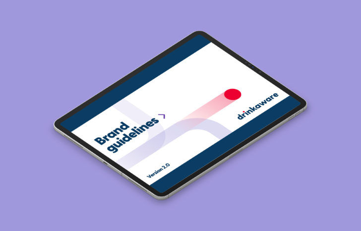
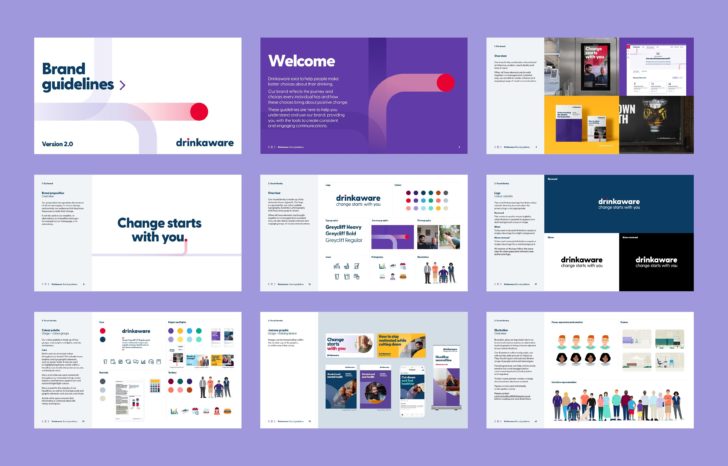
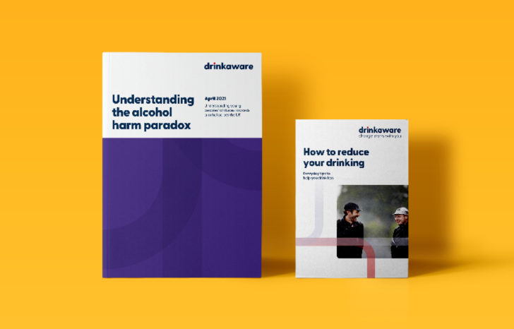
– Brand guidelines and assets
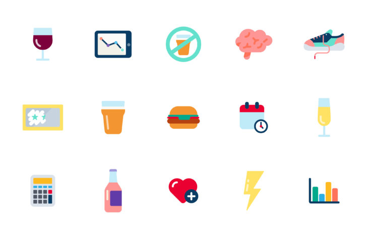
– Bespoke illustration and icon suite
– Social asset templates
– Digital design system
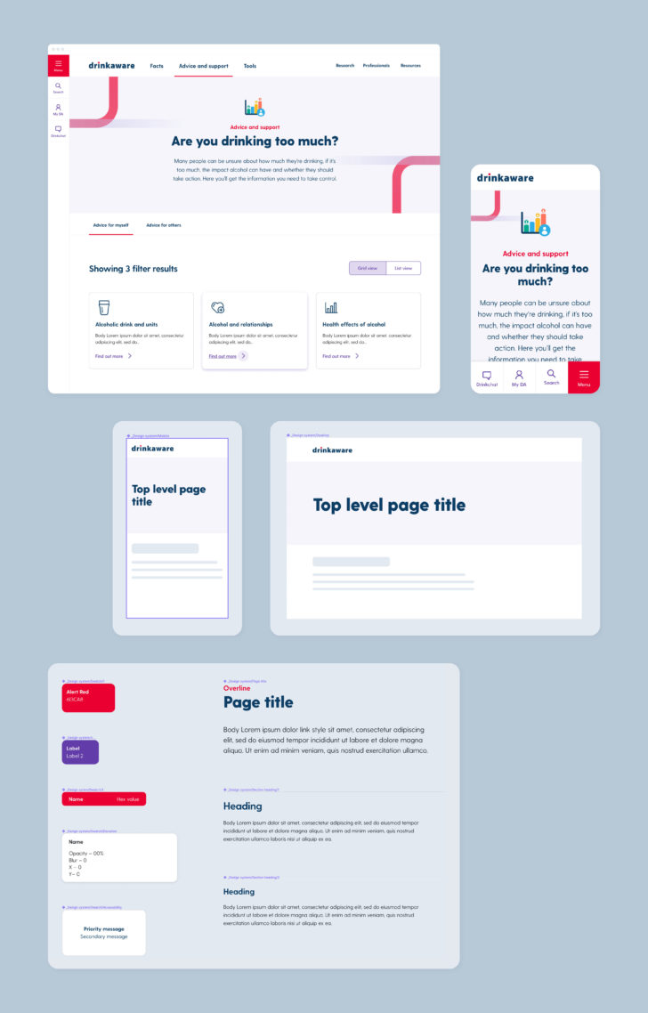
– Website and app UI
– Apple App Store/Google Play assets
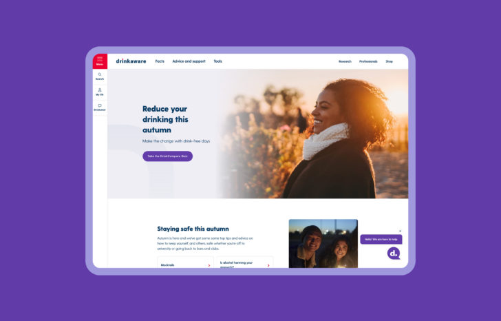
Helping to relaunch two key digital products
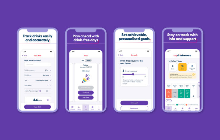
The main drivers of the visual identity refresh were the relaunch of the Drinkaware website and the MyDrinkaware app, which helps people to plan ahead, make realistic lifestyle changes, track progress and achieve goals.
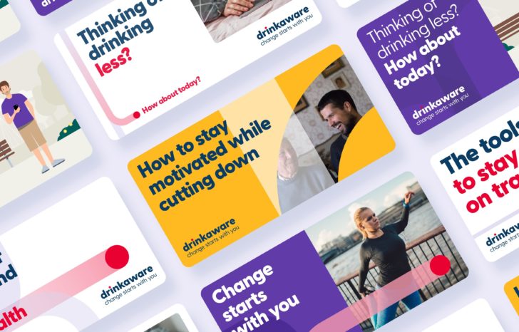
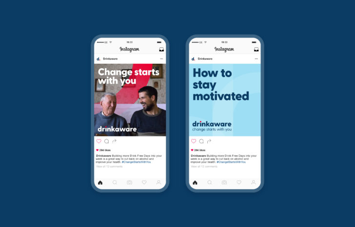
Gaining a rounded view
We conducted background research and a visual audit of Drinkaware’s online and offline outputs, to gain a rounded view of the organisation and its visual expression. This way we could think about how Drinkaware’s audiences might interact more effectively with the brand.
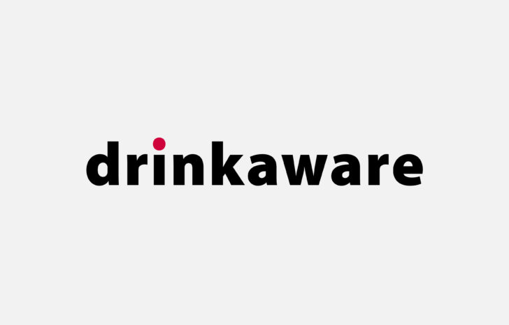
Re-crafting the logo
Initially, the logo was not part of the brand refresh. But as the project progressed, it was felt that a subtle re-crafting would improve legibility and align with the introduction of a clearer and more accessible typeface.

Digital design system
We defined the digital elements of the user interface library and ensured the system conformed to accessibility standards. This was followed by a comprehensive visual inventory as a way of seeing what could be merged, removed or synchronised.
App UI design and campaign
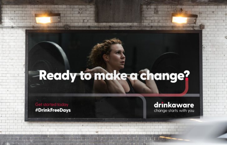
The visual identity programme and design system have allowed Drinkaware to deploy the brand across the new website and the MyDrinkaware app. We have since created a campaign to promote the app on Google Play and Apple App Store.
