Canal & River Trust
Refreshing the brand to increase engagement

Making life better by water
The Canal & River Trust looks after 2,000 miles of waterways across England and Wales. Their research shows that spending time by water really can make us feel happier and healthier.
Following a successful rebrand the previous year, Red Stone was commissioned to make the visual identity work harder in specific channels and areas of work.
What we delivered
– Brand development
– Photography and film guidance
– Illustration and icons
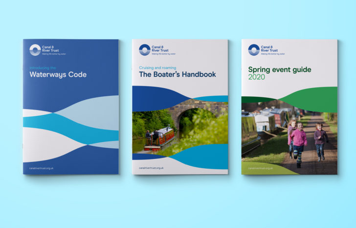
– Brand guidelines
– Mascot development
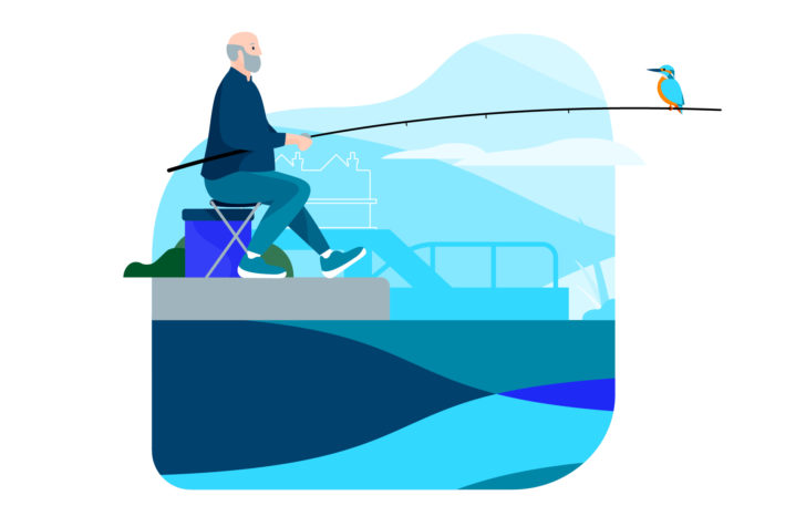
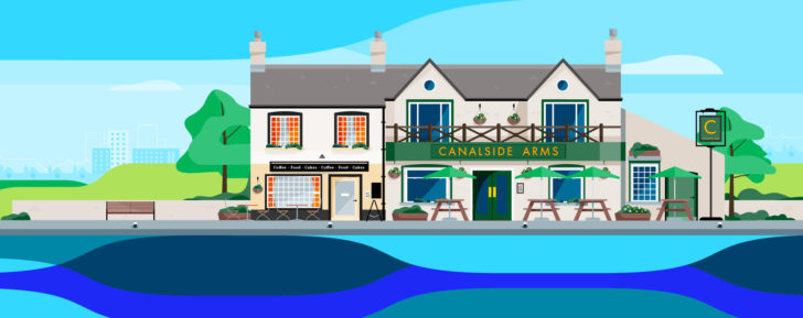
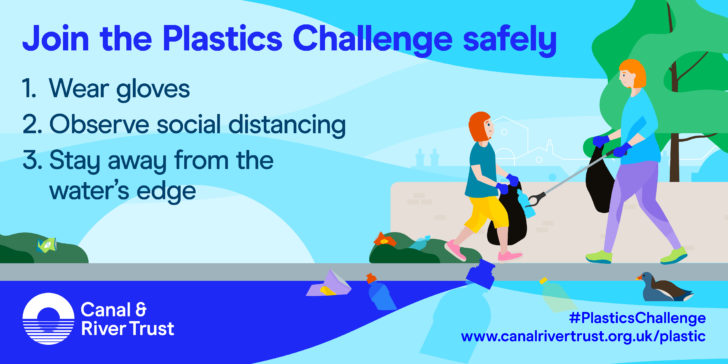
A new approach to illustration
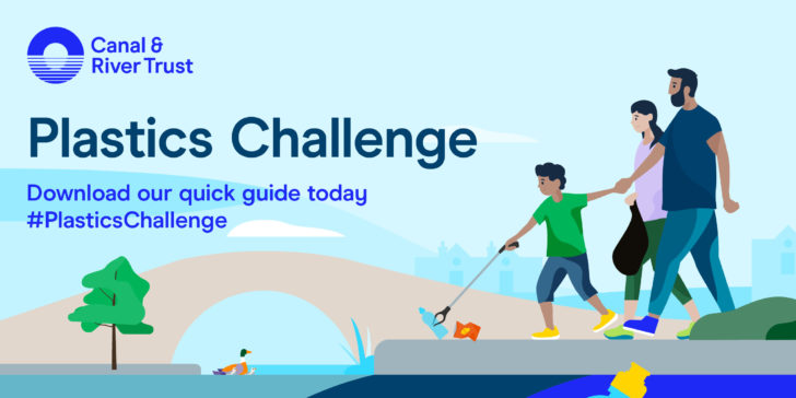
The new illustration style helps to tell the Trust’s story and to support the creation of infographics. The new approach incorporates the brand pattern to make a link between the pictorial and abstract elements of the brand.


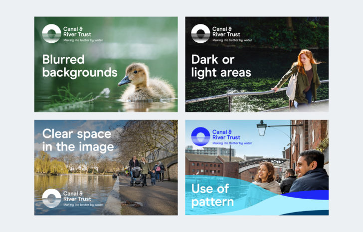
The brand in photography and film
The photography guidance we developed takes the rich imagery around canals and rivers and gives advice on how to use it in practice. With film becoming increasingly important, we integrated that into the wider brand too.
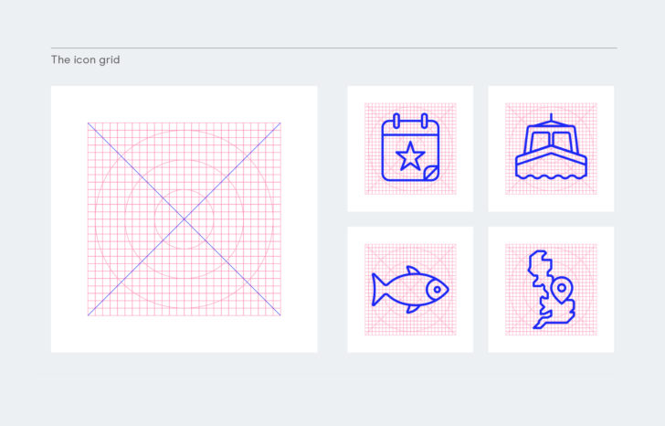
Icons, symbols and pictograms
We developed a library of over 30 new icons for digital and print along with guidance on how to develop new ones. The icons are everyday items, rooted in everyday life.

Improving the way the brand works in digital
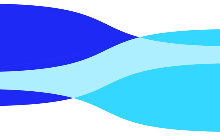
The brand pattern is a key element of the visual identity in print communications. Its use has proved difficult in digital applications where formats are restricted.
Our approach allows several orientations giving flexibility to formats from web banners to social media use.


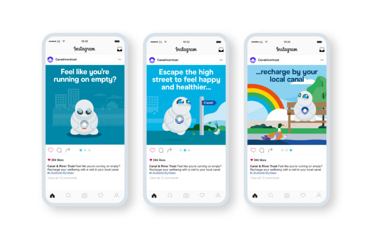
The Trust launched Well-B, their new mascot, in a mass market ‘recharge by your local canal’ brand awareness campaign. Well-B represents wellbeing and how much better you can feel when you spend time by water.
Originally developed as a 3D rendered character for live action film, Well-B needed to be used more widely. We created a number of graphic versions so Well-B could boost brand recall across all brand touch points.
"Red Stone is brilliant. They really listened to us and took time to understand our requirements. They’re all very talented in their different roles, and we’ll continue to work with them in future."
Marketing Services Manager, Canal & River Trust
More like this
Twins Trust
Transforming a charity’s brand