Bank of England
Brand identity refresh

The Bank of England commissioned Red Stone to review their brand identity to make it work harder across their channels.
We worked with the Bank's creative team to establish a clearer brand hierarchy and identity system. The brand work supports the Bank’s mission to become more open and transparent and to target its communications to audiences across the world.

What we delivered
– Brand development
– Reporting
– Stakeholder engagement and C-suite presentations
– Messaging
– Photography and art direction
– Illustration, infographics, icon set
– Social assets
– Motion
– Brand guidelines
– Interactive PDF, templates
– Print
Adaptive logos
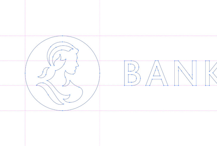
Following a comprehensive review, and extensive creative exploration phase, we developed a new iteration of the core Bank of England logo, to maximise impact and recognition across the Bank's digital channels.
New visual brand resources
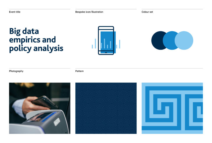
The new brand identity takes inspiration from the architectural and decorative details of the iconic Bank of England building on Threadneedle Street. We created a series of patterns based on these elments to form a flexible and distinct graphic system for the brand.
We developed a colour palette based on the colours of British banknotes alongside a graphic system for creating a wide range of distinctive communications materials.




Brand expression
Red Stone created a flexible graphic approach equipping the Bank with a system to develop content for each of its core audiences in a distinct, yet coherent voice.

Events
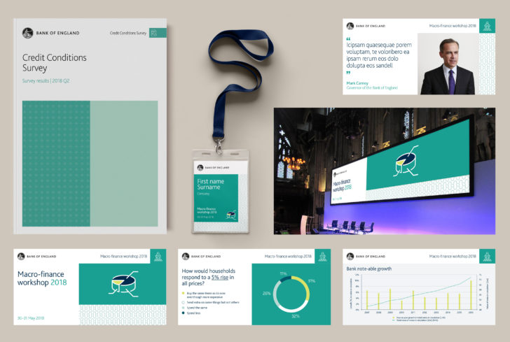
The Bank runs numerous events across the UK, from school visits to global conferences. Our graphic system was developed across the suite of conference deliverables.




Education
The Bank of England's education team required a slightly different creative approach for their resources. We created a suite of blends, taking inspiration from the banknote holograms, for use across resources, events and competitions.


