Kids
A vibrant new brand for a children’s charity
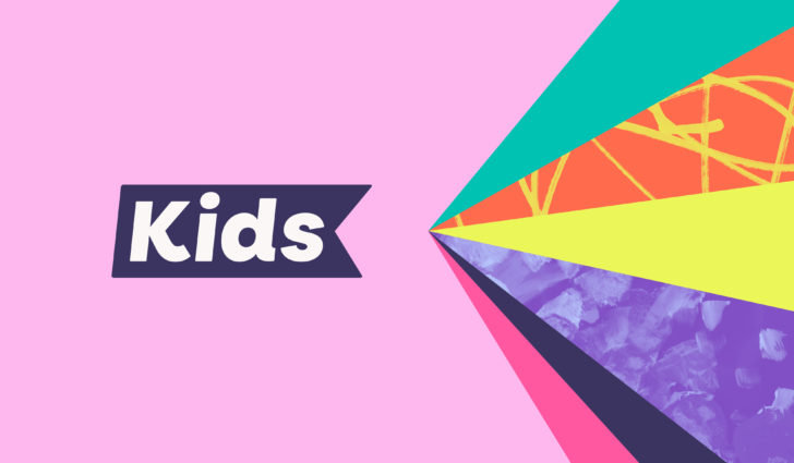
Kids is a charity working with children and young people with special education needs and disabilities, young carers and family members. It’s on a mission to create a world where all kinds of children and young people have all kinds of opportunities. Red Stone worked with brand strategist Dan Dufour to create a new brand with a joyful and vibrant tone of voice and visual identity.
"This project was a lovely opportunity to champion equality, diversity and inclusion in charity branding – and have some fun. It was very clear that people wanted the brand to focus on what children and young people can do, not what they can’t do. People also wanted the brand to celebrate individuality, which shines throughout the strategy and visual identity."
Dan Dufour
A bundle of energy
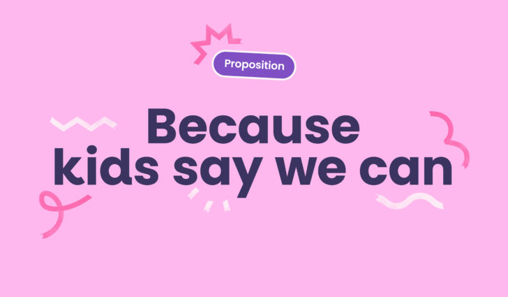
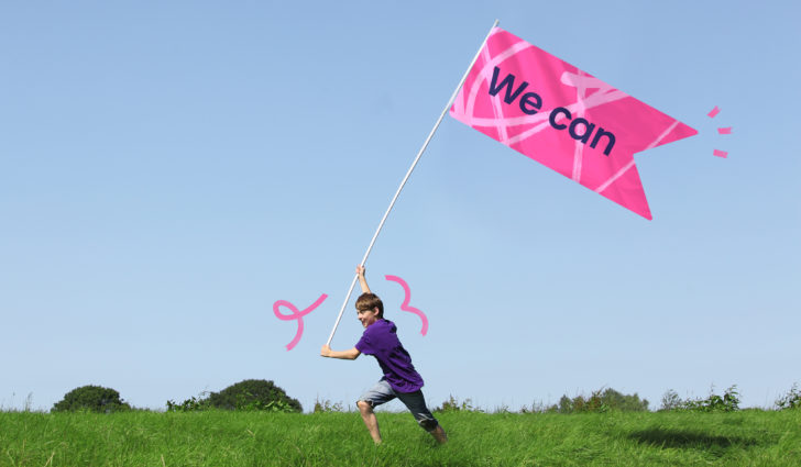
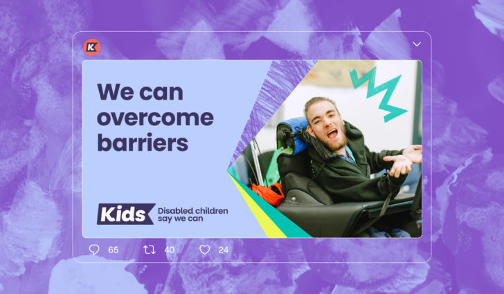
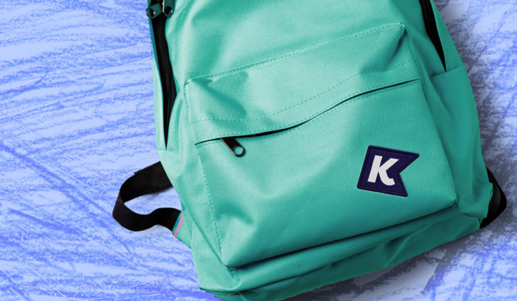
‘When the world says we can’t, kids say we can’. This ‘can do’ attitude and positivity is at the heart of the brand strategy and visual identity. The new logo epitomises this energy. A flag for the Kids community to fly high, in motion the marque is a bundle of energy – celebrating individuality, excitement and vibrancy – because that’s what Kids is all about.
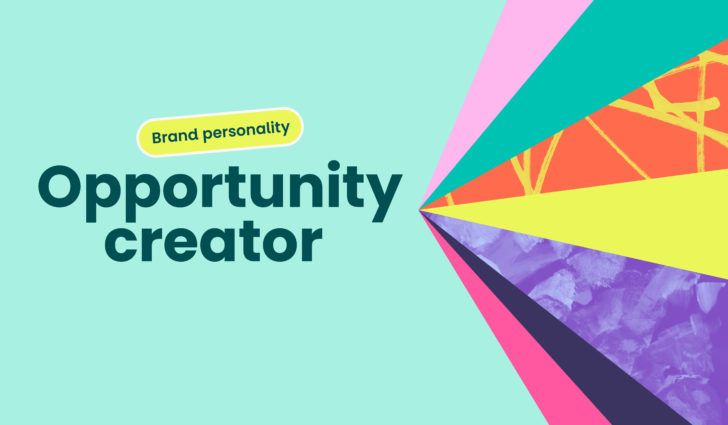
Hello opportunity
The brand personality ‘Opportunity creator’ is reflected in the dynamic ‘sunburst’ graphic, which drives a robust and expressive identity system. Both flexible and structured, characterful and accessible, it injects energy into everything Kids do. This accessibility runs through every part of the brand from language and tone of voice to colour and typography.
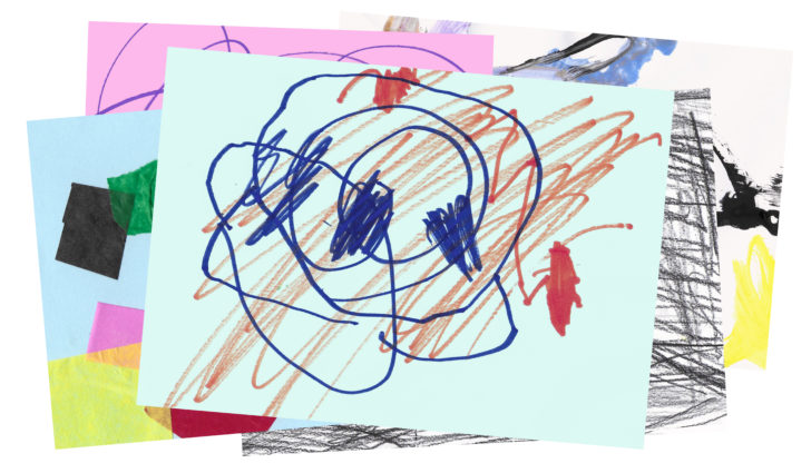
Championing creativity
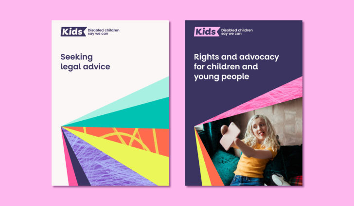
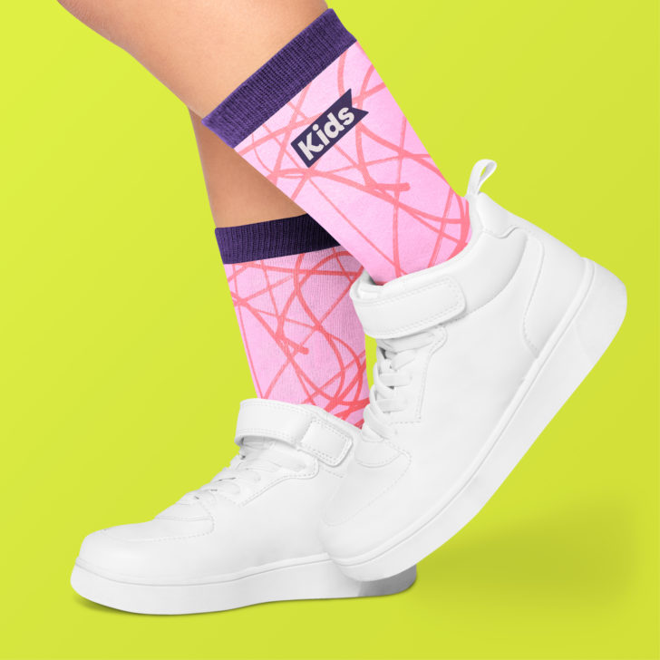
Championing creativity is a cornerstone of the brand strategy. Original artworks created by children and young people are used as unique graphic assets throughout the brand system, creating an unexpected and attention-grabbing series of textures and patterns that give every asset a pop of creativity.
A short promotional film, created for Kids pro bono, keeps that commitment to championing creativity going. The voiceover artist for the film is a young autistic man, with support from ArtBox. Red Stone commissioned him for the project – he plans to be a voiceover artist, and this was his first paid job.
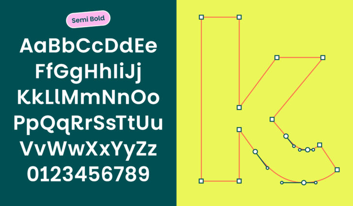
Accessibility with attitude
We created a custom version the Google font, Poppins, to make Popp Kids – a bespoke typeface that matches increased accessibility with plenty of personality. Unambiguous letter forms, large lower-case characters and distinctive shapes give the brand a distinctive voice that doesn’t compromise on legibility.
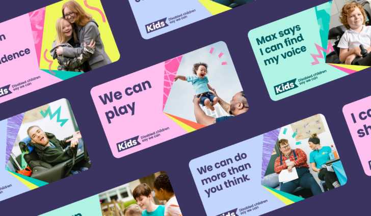
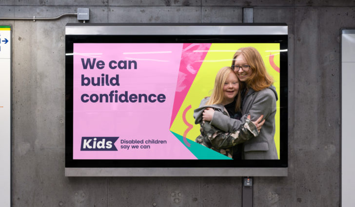
Celebrating individuality
Natural, positive and authentic photography reflects the brilliantly unique children and young people Kids work with. Combined with a bold and inclusive tone of voice, the brand champions equality, diversity and inclusion in everything it does.
A brand for everyone
The result is a bold, energetic and collaborative brand for everyone. It gives Kids the tools to make a splash and create brighter futures with children and young people together.
Indigo Awards 2025
Gold: Branding for NGO & Non-Profit
Gold: Branding for Kids
Silver: Branding for Social Change
Transform Awards 2025
Gold: Best visual identity by sector: Charity, NGO or NFP
iF Design Awards 2025
Winner: Communication: Public branding category
Creative Communication Awards (C2A) 2024
Winner: Brand identity / Branding
Better Future LONDON Design Awards 2024
Gold: Graphic Design - Identity and Branding
Better Future GOV Design Awards 2024
Gold: Graphic Design - Identity and Branding
Better Future WILD Design Awards 2024
Silver: Graphic Design - Identity and Branding
Best Brand Awards 2024
Silver: Identity and logo design
Third Sector Awards 2024
Highly Commended: Brand development
Design Masterprize Awards (DMP) 2024
Winner: Brand relaunch
IDA International Design Awards 2024 (USA)
Honourable Mention: Brand identity
"Children are inherently positive, seeing opportunity and not barriers, and we want to embrace that. You will see that reflected in our new proposition: when the world says we can’t, kids say we can."
Claire Coussins, Director of fundraising and engagement
More like this
The Portal Trust
Naming and brand repositioning