Walk Wheel Cycle Trust
Comprehensive rebrand
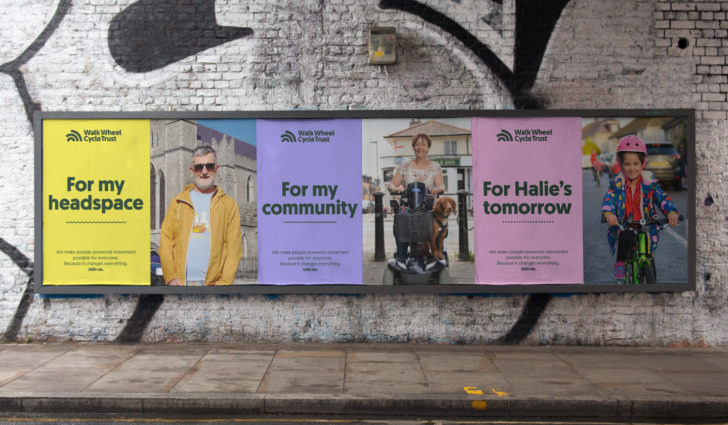
Making active travel essential
Walk Wheel Cycle Trust is a people-powered movement on a mission to make active travel possible for everyone. Formerly named Sustrans, the charity has been involved in community-led action on active travel for almost 50 years. But brand awareness had declined and in an increasingly competitive fundraising environment, the organisation needed to reposition itself, and its cause, as not merely a nicety, but a necessity.
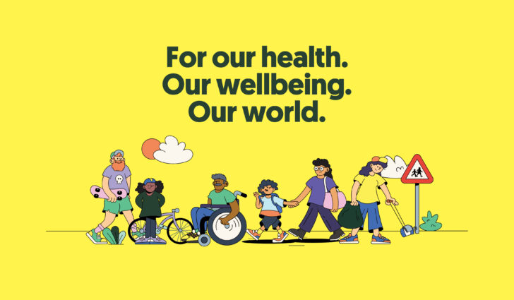
Getting to the heart of it
Fundamental to the branding programme was bringing clarity to the mission and purpose of Walk Wheel Cycle Trust. People who knew the previous organisation were deeply invested in it and understood the benefit of its work, but for the general public there was confusion around who they were, and what they did.

The name
With clarity of purpose so central to the project’s success, the name became an important element to the evolution of the brand. While there was significant equity and recognition of ‘Sustrans’ with existing supporters, the name was a barrier to new audiences. Not only did it not speak to what the charity does, but it created misleading perceptions that had to be overcome.
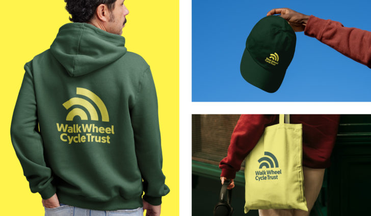
Bringing people-powered movement to life
Since its inception, the charity has always had a spirit of doing things differently. But over time, that spirit had been diluted. The new brand positioning wanted to bring that spirit back. Built around four simple, but strong, personality traits – switched-on, straight-talking, friendly, and fresh – the new brand embodies the can-do, collective attitude that runs through the whole organisation.
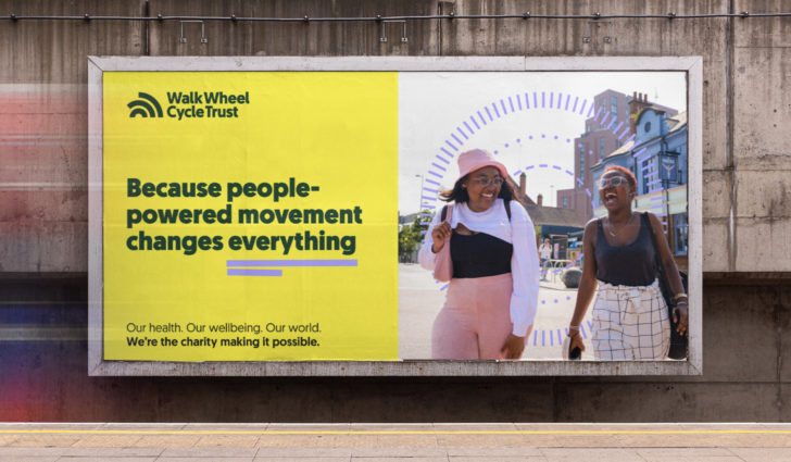

Purpose and practicality made visual
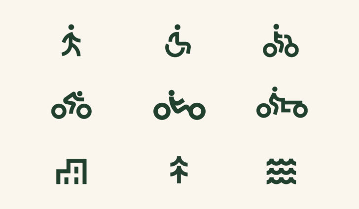
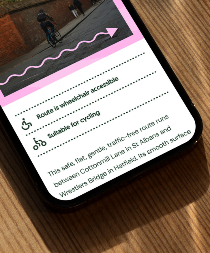
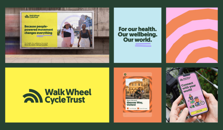
Our graphic language is built around two central themes; the ripple effect at the heart of the strategy and the rich visual language of maps, routes and wayfinding. For a charity rooted firmly in the physical world, this visual reference gave us a natural and ownable graphic language that can flex from the expressive to the functional.
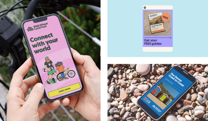

Flexible consistency
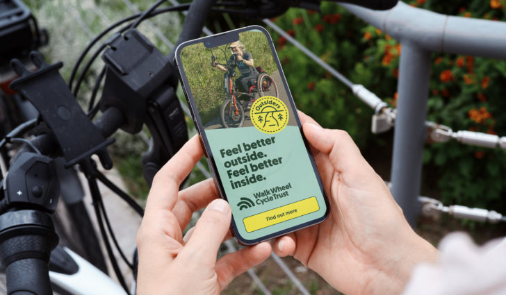
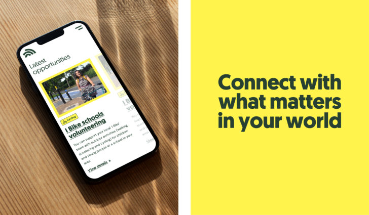
A major driver for the brand was to diversify income and increase propensity to support. So creating an approach that could cut-through and resonate with a new supporter audience was critical. But at the same time, the charity needed to continue to be reassuring to the corporate partners, local authorities and institutions they work closely with, in order to drive the change they seek.
The result? Putting flexible consistency at the heart of the identity. This allows the brand to move seamlessly from big and bold public-facing materials, to more direct, data focused, reporting.
Gearing up for change
The new brand gives Walk Wheel Cycle Trust more than a new set of wheels. It boils down the spirit of an organisation that has been making people-powered change happen for almost 50 years and gives that energy and mission a new purpose fit for the future.
Impact
33%
prompted awareness, already up on the average over the last two years for Sustrans.
21%
of people say they know what Walk Wheel Cycle Trust does. A huge improvement on the Sustrans brand.
32%
Over 32% of people say they're likely to support Walk Wheel Cycle Trust much stronger than the Sustrans brand.

Better Future GOV Design Awards 2026
Silver: Identity and Branding

