Penny Brohn UK
Personalised cancer care. For everybody, everywhere.

Hope through the clouds
Penny Brohn UK is the cancer health and wellbeing charity. They help people feel better in mind, body and spirit by offering everybody with cancer a choice of personalised cancer care.
We partnered with the charity alongside brand strategist Dan Dufour to develop a bold new visual identity that better represents their diverse community, reflects the range of holistic care they offer and reimagines what cancer care looks like.
Bringing the strategy to life
The new strategy positions Penny Brohn UK as Cancer Wellbeing Champions – helping people find hope even in the darkest days. This position provides the foundation for the new visual identity.
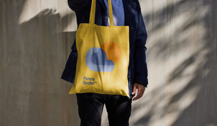
At its heart is the brand marque. An abstracted monogram of founder Penny Brohn’s initials is rotated to reveal a universal symbol of hope – the sun through the clouds.

An accessible and vibrant system
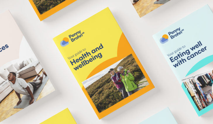
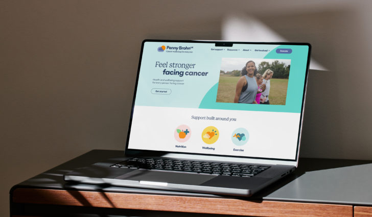
This bold and uplifting marque sets the tone for the entire identity system, a simple yet flexible kit of parts that seeks to open up cancer care and stand out in the sector.
A vibrant colour palette with accessibility at its core strikes an approachable and flexible tone, whilst a contrasting font pairing speaks to the empathy and empowerment at the heart of Penny Brohn UK.
Subtle typographic detailing allows for a more expressive tone of voice, and a simple graphic language derived from the logo creates a consistent and adaptable system that can flex for different audiences and situations.
Celebrating individuality in all its forms
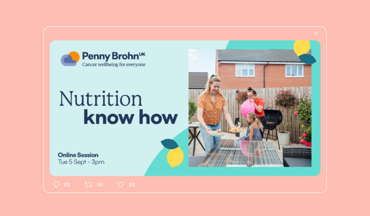
In addition to photography representing people living with cancer and their everyday experiences, a bold ‘cut out’ approach to portraits of the charity’s people, aims to form more personal connections, celebrating each person's individuality and personality.

Taking cues from the marque, a set of icons and illustrations complete the graphic system. Representing the organisation’s three themes – nutrition, wellbeing and exercise – the icons and illustrations make the brand easier for cancer patients to navigate and understand the range of support on offer.

"At Penny Brohn UK, we had an outdated brand and needed to revitalise it and engage new supporters. Red Stone did an amazing job of modernising our brand, injecting colour and life into it, while staying true to the history and important legacy of the past. It was brilliant working with Red Stone and I’d certainly recommend them to other charities looking for a refresh."
Head of Brand, Marketing and Influencing, Penny Brohn UK
Embedding the message of hope
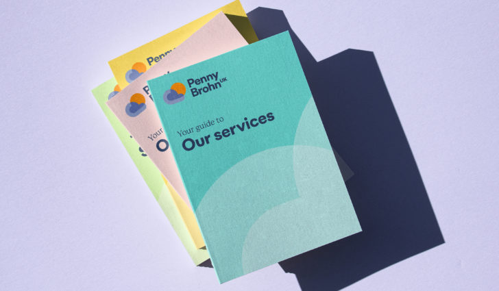
The brand lives across all touchpoints of the charity’s brand, spreading Penny Brohn UK’s message of hope even in the darkest times.


Better Future World Design Awards 2025
Silver: Graphic Design - Identity and Branding
Better Future Gov Design Awards 2024
Silver: Graphic Design - Identity and Branding
Best Brand Awards 2024
Silver: Identity and logo design
