Parkinson's UK
Changing perceptions of a household charity name
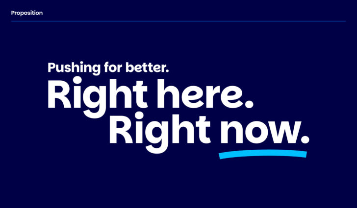
Pushing for better. Right here. Right now.
In recent years, living with Parkinson’s in the UK has become more difficult. More than ever, people want rapid improvements to services, and direct access
to support, information and treatments that can help them live better with Parkinson’s, right now.
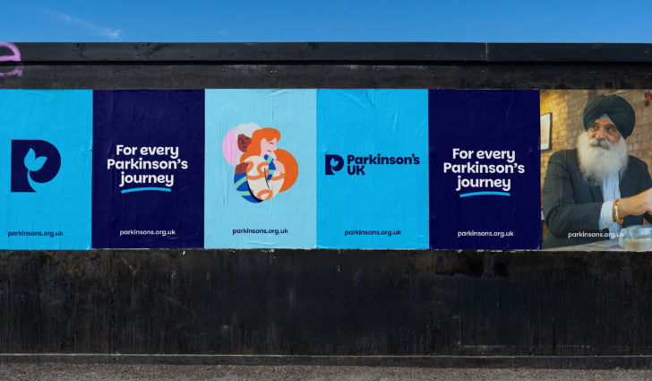
Red Stone partnered with Parkinson's UK to build a brand that reflects and meets the needs of their community. The new organisational strategy aims to make it possible for every person living with Parkinson’s to live better today. To achieve it, they needed to revitalise and reposition the brand. To be more visible, more relevant and more accessible to more people in more places.
Strategic approach – connecting with our audience
We dug deep to understand the condition, the organisation and the incredibly diverse experiences of people living with Parkinson’s. We ran workshops and interviews, subscribed to podcasts, visited events and local branches to get to know what peoples’ experience of living with Parkinson’s was really like.
And what did we hear? That people want things to be better now. That they can’t wait for changes some time down the line. That small victories today matter as much as the promise of future breakthroughs.
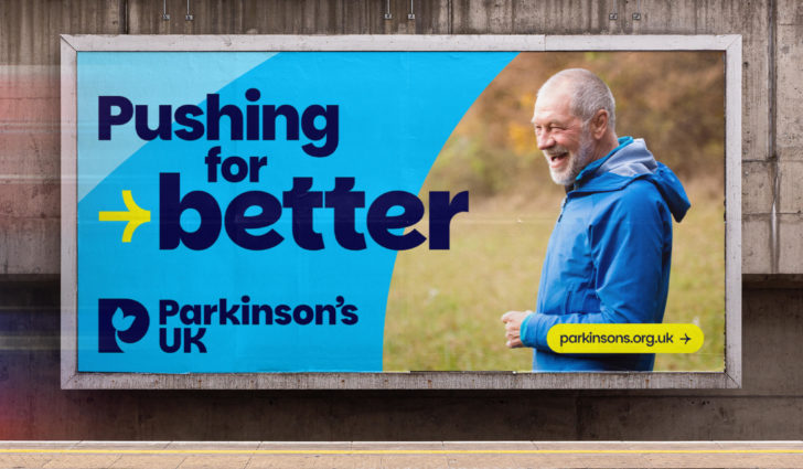
The concept of making tangible improvements today drove the new proposition – that Parkinson’s UK is the charity ‘Pushing for better. Right here. Right now’. From local branch support, to research and healthcare, everyone is united by a desire to make the biggest positive difference to lives today.
Supported by a new brand personality of ‘relentless doers’ and underpinned by a refreshed brand purpose, the brand position gives Parkinson’s UK the tools it needs to reach more people, more effectively.
The search for a symbol
How do you create a symbol of belonging for a condition with over 40 different symptoms? For people living with Parkinson's and their friends and families, for local branches and healthcare professionals, for fundraisers and researchers?
From the discovery phase of the project, it was clear the creation of a symbol was key to unifying the organisation and increasing brand awareness.
Over the years, the Parkinson’s UK brand architecture had grown and expanded. But without a strong graphic marque, brand equity was being diluted and there was a lack of clarity over where the charity were present.
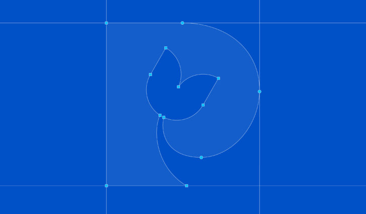
But defining what Parkinson’s looks like, or even feels like isn’t easy. Following an intense creative phase, lots (and lots) of marque exploration and consultation with people from the Parkinson’s community, we arrived at a marque capable of reflecting an organisation and acting as a symbol of belonging for a condition that cannot be easily summed up.
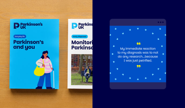
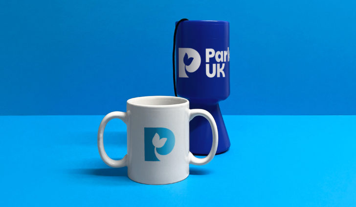
Inspired by the charity's past, but built squarely for the here and now, the new marque incorporates the Parkinson’s tulip – an international symbol for Parkinson’s – recognised by the Parkinson’s community across the UK and around the world.

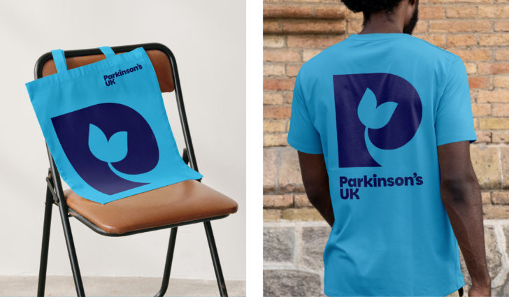
A brand for everyone
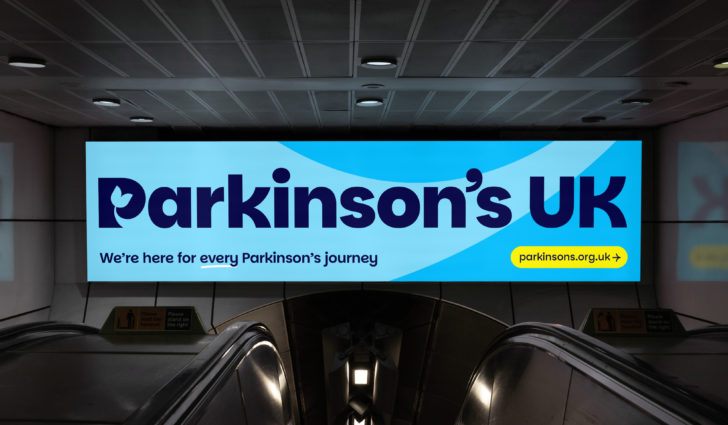
When ‘being there for every Parkinson’s journey’ is an organisational priority, accessibility is a non-negotiable. So accessible design drove the creative process – from type and colour that met technical standards, to how the brand was created and shared.
The brand is used by volunteers at local branches across the country, so we needed to make sure we created a visual identity that not only packed the right personality punch, but could also be accessed and used by everyone, everywhere.
Parkinsans – a proprietary font available to all
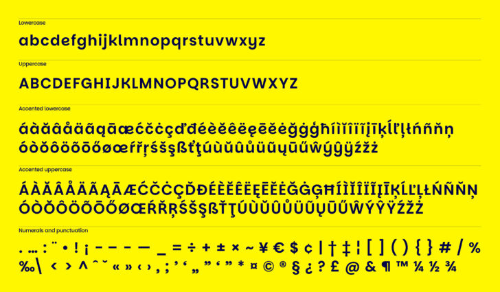
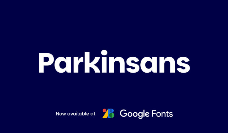
Step forward Parkinsans – the new brand typeface designed and developed in-house by Red Stone, for Parkinson’s UK. Crafted to be visible, approachable, flexible and accessible, Parkinsans defines the brand voice. But to make the brand accessible to anyone creating brand materials, the typeface needed to be readily available everywhere. We opted to create an open source typeface to embrace this idea of access to all. Now available on Google Fonts, Parkinsans is truly available to everyone.
We knew from discovery that we couldn't always rely on volunteers and members being able to use all brand assets when creating materials. But by baking as much distinct brand character into the typeface as possible, we could ensure a distinct and recognisable brand presence through the use of type alone.
Taking stylistic references from the marque and the realities of living with Parkinsons, Parkinsans is human, energetic, imperfect and sprinkled with unexpected quirks.
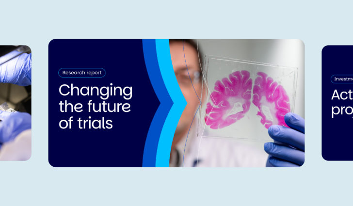
The flex in weights gives Parkinson’s UK the ability to dial up and down their tone seamlessly – from attention grabbing headlines, to research reports.
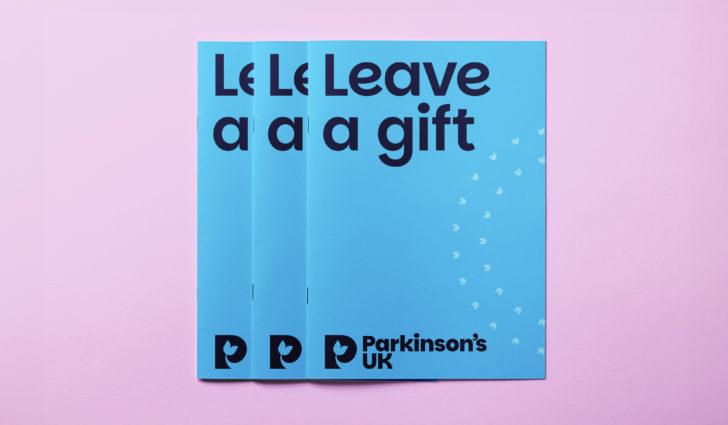
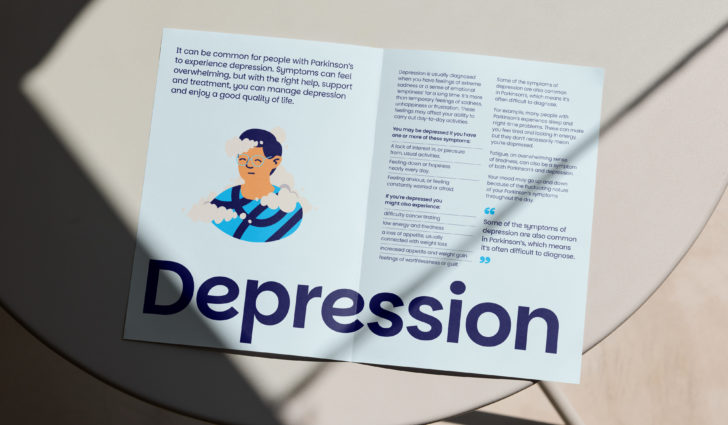
Expressing our personality. More emotive. More gutsy.
The previous identity had initially served the brand well, but over time inconsistency had crept in and a lack of tonal flex, plus issues with accessibility and changes in organisational direction, meant various internal teams felt they no longer had the tools or tone to connect with their audiences.
The new brand needed to remedy this – upping the emotion, making flexibility and accessibility design foundations and helping the organisation regain its gutsy voice.
The brand personality of ‘relentless doers’ drove this shift. Bringing an energy and directness to everything, whilst giving the brand the tonal range to adapt to different subjects and situations.
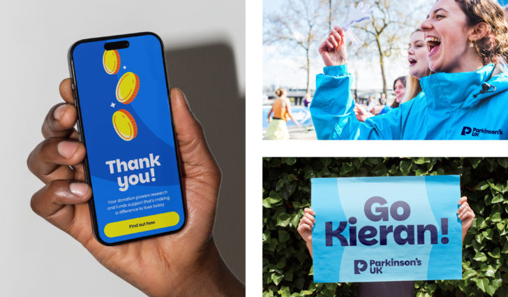
We built out a flexible, easy to implement graphic system that empowered rather than inhibited users.
Stemming from the logo, the graphic language is reflective of the drive of the brand personality and the journey of living with Parkinson’s. The ups and downs. The good days, the bad days, the everyday days.
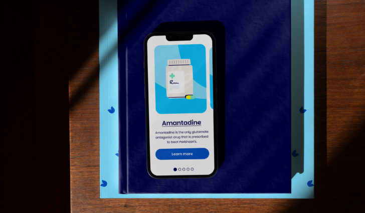
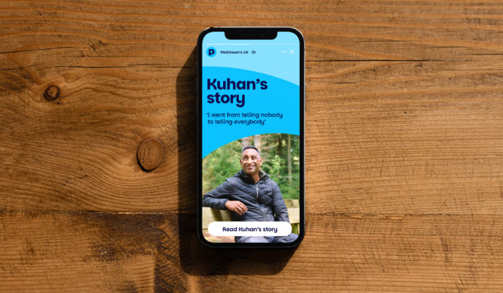
Supporting the graphic language and typography, a refreshed colour palette and new approach to illustration helps Parkinson’s UK tell a wider range of stories and deal with difficult subjects in a more engaging and relatable way.
Easy to implement and flex, packed full of personality, the graphic system embodies a step change for Parkinson’s UK. A brand that’s more visible, more accessible and more relevant. A brand that’s built for everyone to be able to access and use. A brand built to help the organisation meet the needs of every Parkinson’s journey. Right here. Right now.
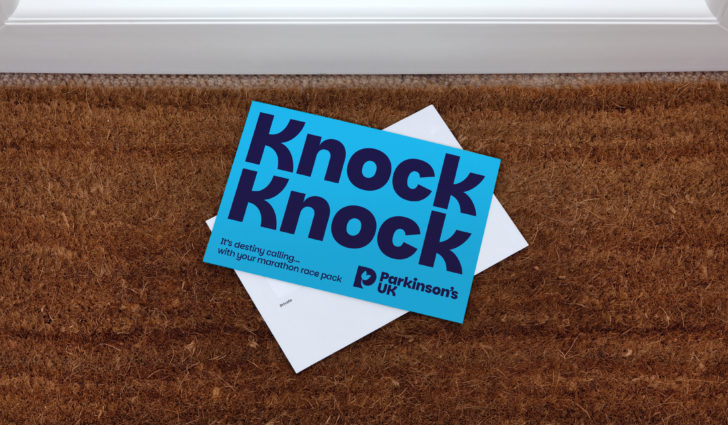
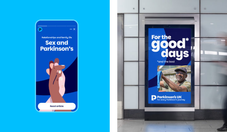
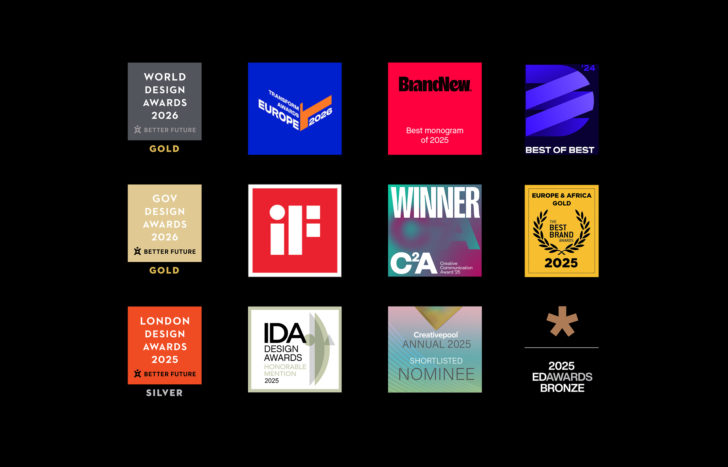
Better Future WORLD Design Awards 2026
Gold: Graphic Design - Identity and Branding
Transform Awards 2026
Gold: Graphic Design - Identity and Branding
BrandNew The Year in Review 2025
No 1: Best in Monograms
Design Masterprize 2025
Best of the best: Branding and Corporate Identity
Better Future GOV Design Awards 2026
Gold: Graphic Design - Identity and Branding
iF Design Awards 2026
Winner: Branding & Communication Design
Creative Communication Awards (C2A) 2025
Winner: Category: Brand identity / Branding
Best Brand Awards 2025
Gold: Logo and Identity categories
Better Future LONDON Design Awards 2025
Silver: Graphic Design - Identity and Branding
International Design (IDA) Awards 2025
Honourable Mention: Brand identity
Creativepool Annual 2025
Shortlisted: Brand category
European Design Awards 2025
Bronze: Branding: Company logo

